Unleashing the Power of CSS Methodologies: A Deep Dive into Techniques, Comparisons and Trending Methods


Master CSS Methodologies: Enhance Your Web Development Skills with Scalable and Efficient Styling Techniques
Introduction:
CSS (Cascading Style Sheets) is a fundamental component of web development, allowing designers and developers to bring life and visual appeal to websites. However, as web projects grow in complexity, managing and organizing CSS code can become a daunting task. That's where CSS methodologies come to the rescue. In this article, we will embark on an exciting journey as we unleash the power of CSS methodologies and take a deep dive into the world of techniques, comparisons, and trending methods. By exploring these methodologies, you will gain valuable insights into structuring and optimizing your stylesheets, making your code more scalable, maintainable, and efficient.
With the ever-evolving landscape of web development, it is essential to stay up-to-date with the latest trends and techniques. Our exploration will shed light on the most popular CSS methodologies, examining their core concepts and providing practical code examples. We will compare these methodologies, evaluating their strengths and weaknesses, helping you understand which approach may suit your specific needs.
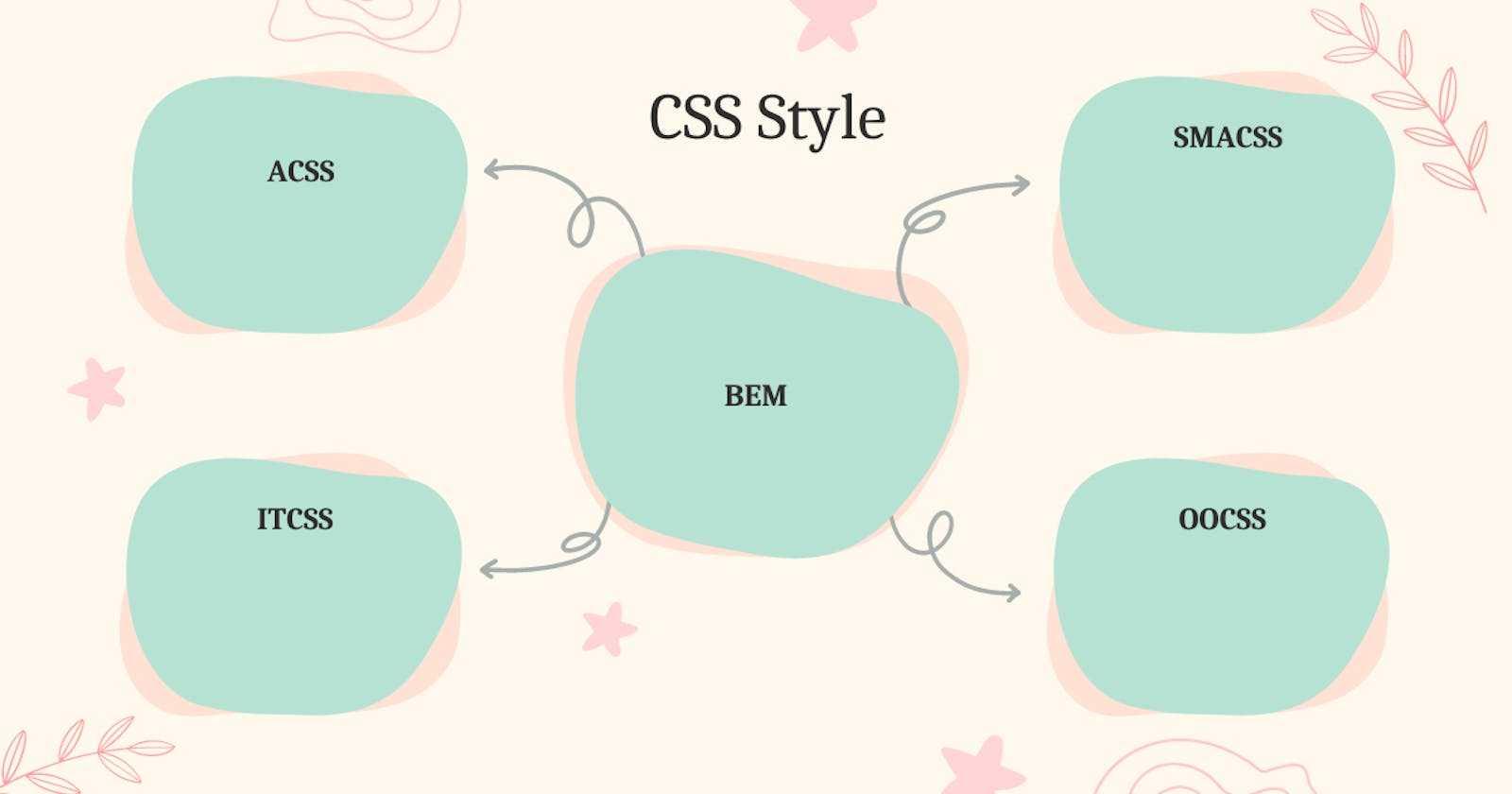
Buckle up as we delve into the world of BEM (Block Element Modifier), SMACSS (Scalable and Modular Architecture for CSS), OOCSS (Object-Oriented CSS), ITCSS (Inverted Triangle CSS), ACSS (Atomic CSS), and more. Each methodology will be dissected, explained, and illustrated with code snippets, empowering you to implement these techniques effectively in your projects.
Whether you're a seasoned developer looking to optimize your existing codebase or a newcomer eager to learn the best practices from the start, this article will equip you with the knowledge and insights needed to master the power of CSS methodologies. By the end of this deep dive, you'll have a clear understanding of the benefits, trade-offs, and trending methodologies in demand, enabling you to create more scalable, maintainable, and visually stunning websites.
Get ready to unleash the power of CSS methodologies and take your web development skills to new heights!
What is CSS Methodology?
CSS is a language used to style and make websites look nice. But sometimes, when websites get bigger and more complicated, it can become difficult to organize and manage all the CSS code. That's where CSS methodologies come in!
CSS methodologies are like sets of rules and guidelines that help us organize our CSS code in a smart and structured way. They make it easier for us to write, understand, and update our CSS as the website grows.
Let's imagine you have a big box full of Lego blocks. You want to build a cool house using those blocks, but you need a plan to make it look neat and organized. CSS methodologies are like different plans that help you systematically arrange your blocks.
One popular CSS methodology is called BEM, which stands for Block Element Modifier. It helps us give names to different parts of our website, like blocks, elements, and modifiers. It's like giving names to different Lego pieces so that we can easily find and use them when building our house.
Another methodology is called SMACSS, which helps us separate different types of styles into categories. It's like sorting your Lego blocks based on their colors or shapes before using them. This way, it becomes easier to find the right blocks when you need them.
There's also OOCSS, which is like taking your Lego blocks and building them in a way that you can reuse them in different houses. It helps us create reusable styles that can be used in different parts of our website, making our code more efficient.
ITCSS is another methodology that helps us organize our CSS styles in a specific order, from general to specific. It's like arranging your Lego blocks from the biggest to the smallest. This way, we can avoid confusion and make sure our styles work properly.
Lastly, there's ACSS or Atomic CSS, which is like using small Lego pieces to build different things. It focuses on creating small and specific styles that can be combined to create different looks. It's like using basic Lego blocks to build different shapes and structures.
So, CSS methodologies are like plans or strategies that help us organize our CSS code, just like how plans and strategies help us build things with Lego blocks. They make it easier for us to manage our code and create awesome websites!
I hope that explanation helps you understand CSS methodologies better!
CSS Methodologies in demand today
The demand for CSS methodologies may vary based on individual preferences, project requirements, and industry trends. However, here are five CSS methodologies that are widely recognized and popular in the web development community:
BEM ( Block Element Modifier )
SMACSS (Scalable and Modular Architecture for CSS)
OOCSS (Object-Oriented CSS)
ITCSS (Inverted Triangle CSS)
Atomic CSS
Deep Dive into Methodologies
BEM ( Block Element Modifier )
Imagine you are building a Lego house. BEM methodology is like giving specific names to different parts of the Lego house, making it easier for you to find and assemble them correctly.
In BEM, we have three main parts: Blocks, Elements, and Modifiers.
Blocks:
Think of blocks as the major components of your Lego house. They are standalone, independent pieces that have a specific purpose. In CSS, a block is represented by a class name. Let's say we have a "card" block in our example:
  <div class="card">
    <!-- Content goes here -->
  </div>
Elements:
Elements are the smaller parts or components within a block. They cannot exist or make sense without being part of a block. To identify elements, we use double underscores ( '__' ) after the block's class name. Let's say we have a "title" element within our "card" block.
  <div class="card">
    <h2 class="card__title">Welcome</h2>
    <!-- Other elements and content -->
  </div>
Modifiers:
Modifiers allow us to change the appearance or behavior of a block or element. They represent variations or different states. To identify modifiers, we use double dashes ( -- ) after the block or element's class name. Let's say we have a "highlighted" modifier for our "card" block.
  <div class="card card--highlighted">
    <!-- Content goes here -->
  </div>
So, in the above example, we have a "card" block with a "highlighted" modifier applied to it.
Using the BEM methodology helps us in a few ways:
It provides a clear structure to our CSS code, making it easier to understand and maintain.
It reduces the chances of CSS styles conflicting with each other.
It promotes reusability and modularity since blocks and elements can be used in different parts of the website.
By naming and organizing our HTML elements and CSS classes following the BEM methodology, we can build a Lego-like structure for our website, making it easier to manage and style as it grows in complexity.
SMACSS (Scalable and Modular Architecture for CSS)
Imagine you have a big box of colored pencils, and you want to organize them in a way that makes it easy to find the right color when you need it. SMACSS methodology is like sorting those pencils based on their colors, making it convenient to locate and use them.
In SMACSS, we categorize our CSS styles into five main categories called "modules." Each module has a specific purpose and helps us structure our stylesheets in a scalable and maintainable way.
Base:
The "Base" module includes the foundational styles that set the default appearance of HTML elements. These styles apply globally and create a consistent starting point. For example, you might have styles for headings, paragraphs, links, and other basic elements.
 /* Base module */
 h1 {
   font-size: 24px;
   font-weight: bold;
 }

 p {
   line-height: 1.5;
 }

 a {
   color: blue;
 }
Layout:
The "Layout" module deals with the overall structure and arrangement of the page. It defines the major sections or containers and their positioning. Layout styles are reusable and help create a consistent structure throughout the website.
 /* Layout module */
 .header {
   height: 60px;
   background-color: #f2f2f2;
 }

 .container {
   width: 960px;
   margin: 0 auto;
 }
Module:
The "Module" module represents reusable and self-contained components. It focuses on styling individual UI components rather than the entire page. Each module has its class name, making it easy to identify and use them throughout the project.
 /* Module module */
 .button {
   display: inline-block;
   padding: 10px 20px;
   background-color: #ff0000;
   color: #fff;
   border: none;
   border-radius: 5px;
 }
State:
The "State" module handles styles that are specific to the current state or context of an element. For example, a button may have different styles when it's in a hovered or active state.
 /* State module */
 .button:hover {
   background-color: #990000;
 }

 .button:active {
   background-color: #660000;
 }
Theme:
The "Theme" module deals with the visual styling and customization of the website. It allows for easy theming and customization by defining different color schemes or visual variations.
 /* Theme module */
 .theme-dark {
   color: #fff;
   background-color: #000;
 }

 .theme-light {
   color: #000;
   background-color: #fff;
 }
By categorizing our CSS styles into these modules, we can easily locate and maintain our stylesheets. It helps us create a scalable and modular architecture, making it easier to update or extend our styles as the project grows.
OOCSS (Object-Oriented CSS)
Imagine you have a collection of building blocks, and you want to assemble different structures using those blocks. OOCSS methodology is like categorizing those building blocks based on their shape and functionality, making it easier to reuse them and create various structures.
In OOCSS, we focus on two main principles: separation of structure and skin, and the use of reusable CSS classes or "objects."
Separation of Structure and Skin:
In OOCSS, we separate the structural properties (layout, positioning) of an element from its visual appearance (colors, backgrounds, borders). This separation allows for greater flexibility and reusability of styles.
Reusable CSS Classes or "Objects":
In OOCSS, we create reusable CSS classes that represent visual patterns or "objects." These classes define the styles for a specific object or component, making it easy to apply them to multiple elements throughout the project.
Let's consider an example where we create a simple button object in OOCSS:
 /* Object-Oriented CSS */
 .button {
   display: inline-block;
   padding: 10px 20px;
   background-color: #ff0000;
   color: #fff;
   border: none;
   border-radius: 5px;
 }
In the above example, we define a .button class that represents the styling for a button object. This class includes properties like padding, background-color*,* color, and border-radius. By using this class on multiple buttons in our project, we can ensure consistency and easily update the styling by modifying the .button class.
By adding the .button-highlighted class to our button element, we can apply the highlighted styles without duplicating code:
<button class="button button-highlighted">Click Me</button>This approach allows us to separate the structure ( .button ) from the skin ( .button-highlighted ) and reuse the existing object while applying different visual variations.
OOCSS promotes code reusability, reduces code duplication, and makes it easier to maintain and update styles across different elements and components in a project. By applying OOCSS principles, we can create a modular and flexible CSS architecture that promotes scalability and consistency.
ITCSS ( Inverted Triangle CSS )
Imagine you have a stack of papers that contain different information, and you want to organize them in a way that makes it easy to find specific details. ITCSS methodology is like arranging those papers based on their importance and specificity, creating a structured hierarchy.
In ITCSS, we organize our CSS code into layers, each representing a different level of specificity and importance. The layers are arranged in the shape of an inverted triangle, hence the name. These layers are:
Settings:
The "Settings" layer contains global variables, configurations, and default values that set the foundation for our styles. This layer typically includes things like font sizes, colors, breakpoints, and other basic settings.
 /* Settings layer */
 $primary-color: #ff0000;
 $font-size-base: 16px;
Tools:
The "Tools" layer includes globally available mixins and functions that help with repetitive tasks or complex calculations. These tools can be reused throughout the project and assist in generating CSS styles.
 /* Tools layer */
 @mixin flex-center {
   display: flex;
   justify-content: center;
   align-items: center;
 }
Generic:
The "Generic" layer contains very basic and broad styles that have a global impact. This layer includes CSS reset or normalization styles that ensure consistent rendering across different browsers and devices.
 /* Generic layer */
 body {
   margin: 0;
   padding: 0;
 }

 a {
   text-decoration: none;
 }
Elements:
The "Elements" layer focuses on styling unclassed HTML elements such as headings, paragraphs, buttons, etc. This layer defines the basic styles for these elements without any class or ID selectors.
 /* Elements layer */
 h1 {
   font-size: 2em;
   font-weight: bold;
 }

 p {
   line-height: 1.5;
 }

 button {
   padding: 10px 20px;
   background-color: $primary-color;
   color: #fff;
   border: none;
   border-radius: 5px;
 }
Objects:
The "Objects" layer contains reusable, class-based styling for specific components or UI patterns. This layer focuses on creating modular and reusable styles that can be applied to different elements throughout the project.
 /* Objects layer */
 .container {
   width: 960px;
   margin: 0 auto;
 }

 .card {
   padding: 20px;
   border: 1px solid #ccc;
   border-radius: 5px;
 }
Components:
The "Components" layer deals with more specific and complex components that combine multiple objects or elements. These styles are often unique to individual components and have higher specificity.
 /* Components layer */
 .slider {
   /* Styles for a slider component */
 }

 .modal {
   /* Styles for a modal component */
 }
Utilities:
The "Utilities" layer contains utility classes or helper classes that apply specific styles to override or modify existing styles. These classes are used sparingly and provide quick adjustments without the need for writing new CSS styles.
 /* Utilities layer */
 .text-center {
   text-align: center !important;
 }

 .hide {
   display: none !important;
 }
By following the ITCSS methodology, we establish a clear and structured order for our CSS code, starting from broad and global styles and moving towards more specific and component-related styles. This approach helps in code organization, maintainability, and ensures a predictable and scalable CSS architecture.
Atomic CSS
Imagine you have a set of LEGO bricks, and you want to build different objects by combining those bricks in various ways. The Atomic CSS methodology is like breaking down each LEGO brick into its smallest individual components and reusing them to construct different structures efficiently.
In Atomic CSS, the focus is on creating small, single-purpose CSS classes that represent specific styling properties. These classes are called "atomic classes" or "utility classes." Instead of creating large, specific classes for each element, you combine these atomic classes to build your desired styles.
Let's understand this with an example:
/* Atomic CSS */
.mt-20 {
  margin-top: 20px;
}

.bg-red {
  background-color: #ff0000;
}

.text-center {
  text-align: center;
}
In the above example, we have three atomic classes: .mt-20, .bg-red, and .text-center. Each class represents a single styling property.
Now, let's say we want to style a specific element. Instead of creating a separate class for that element, we combine the relevant atomic classes to apply the desired styles:
<div class="mt-20 bg-red text-center">
  This is a centered div with a red background and 20px margin-top.
</div>
By applying these atomic classes to our HTML element, we achieve the desired styles without the need for writing extensive CSS rules for each specific element.
The key benefits of Atomic CSS are:
Reusability: Atomic classes can be reused across different elements throughout the project, promoting code efficiency and reducing redundancy.
Maintainability: Since atomic classes are small and focused, making changes to specific styles becomes easier and more manageable. Updates to the atomic classes automatically reflect on all elements using them.
Performance: Atomic CSS often results in smaller CSS file sizes compared to traditional approaches, as it eliminates the need for writing repetitive and specific CSS rules.
Scalability: With Atomic CSS, it's easier to add new styles or modify existing ones without disrupting the overall CSS structure. The modularity of atomic classes promotes scalability as your project grows.
It's important to note that Atomic CSS is most effective for smaller components, user interfaces, or rapid prototyping. It may not be suitable for complex layouts or larger-scale projects where more traditional CSS methodologies, like BEM or SMACSS, might be better suited.
The Atomic CSS methodology provides a granular and efficient way to create and reuse small, single-purpose classes, making it a popular choice for projects that require flexibility, maintainability, and performance.
Comparison of Methodologies
| Methodology | Description | Key Concepts | Code Example | Pros | Cons |
| BEM | A methodology that emphasizes clear naming conventions for classes to improve code readability | Block, Element, Modifier (BEM) | .html .block {} .block__element {} .block__element--modifier {} | Clear naming conventions for better readability and understanding | Class names can become verbose and may result in increased file size |
| SMACSS | A flexible and modular approach that focuses on categorizing CSS rules into different modules | Base, Layout, Module, State, Theme (BLMST) | .html .module {} .module__element {} | Promotes modularity and scalability | Requires thoughtful planning and organization to maintain consistency and avoid duplication |
| OOCSS | A methodology that encourages separation of structure and skin, promoting reusability | Separation of Structure and Skin | .html .box {} .box--blue {} | Promotes code reusability and modular design | Requires careful consideration of class names and CSS structure to ensure proper separation and avoid specificity issues |
| ITCSS | A scalable and maintainable CSS architecture that organizes styles based on specificity | Inverted Triangle CSS | Layered structure: Settings, Tools, Generic, Elements, Objects, Components, Utilities | Promotes code reusability and modular design | Requires careful consideration of class names and CSS structure to ensure proper separation and avoid specificity issues |
| Atomic CSS | A methodology focused on creating small, single-purpose utility classes for specific styles | Atomic (Utility) Classes | css .mt-20 {} .bg-red {} .text-center {} | Promotes a structured and scalable architecture | Requires a thorough understanding of CSS specificity and may have a steeper learning curve for beginners |
Summary
While these methodologies are popular, it's essential to consider the specific needs and requirements of your project before choosing a CSS methodology. It's also worth noting that some developers prefer to create their customized methodologies based on a combination of these approaches or by incorporating other techniques.